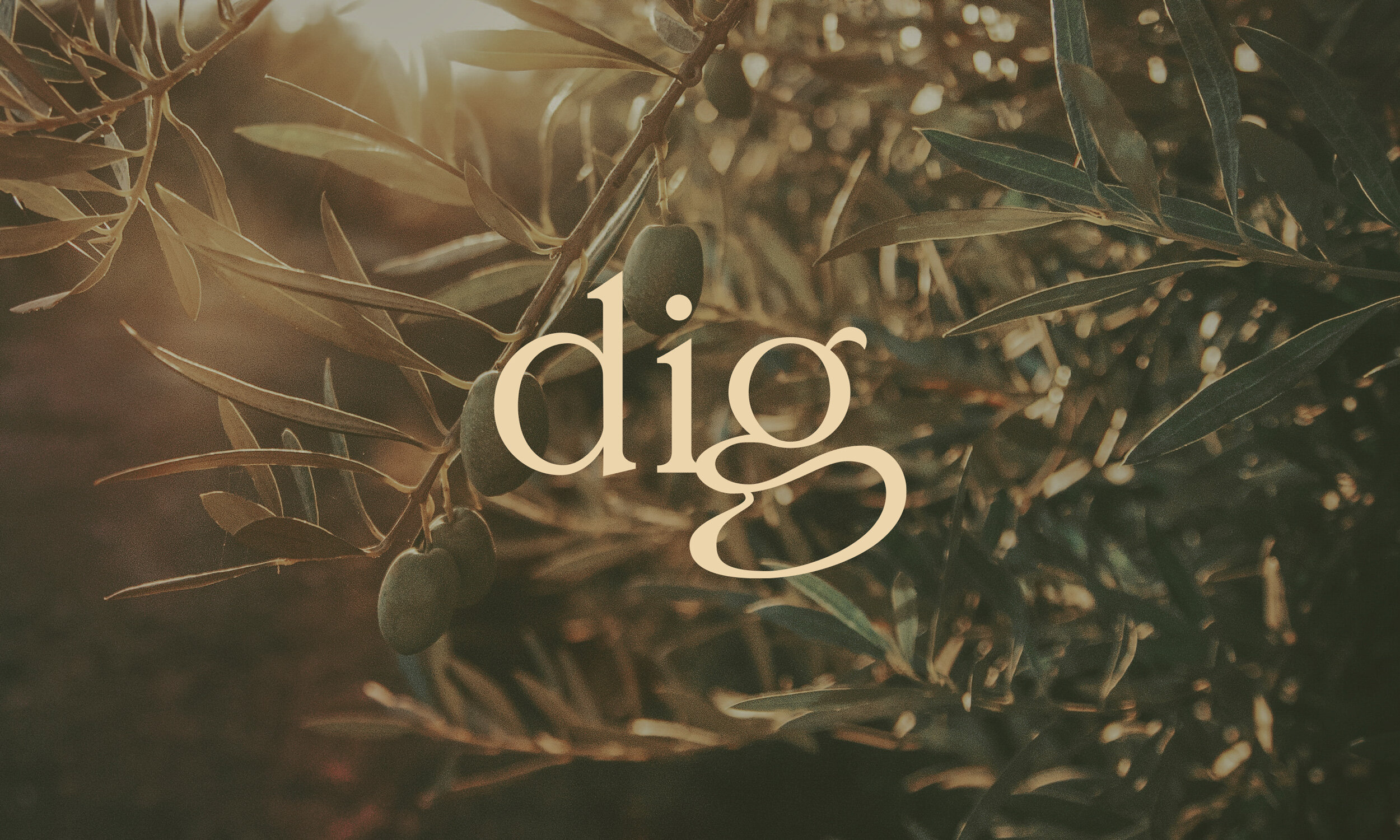
Dig Food Farm Logotype
Client
Dig Food Farm
Skill
Lettering, Type Design, Branding
Located in the Hunter Valley of NSW, Dig Food Farm is a place you can experience the honest work of dirt-ingrained hand.
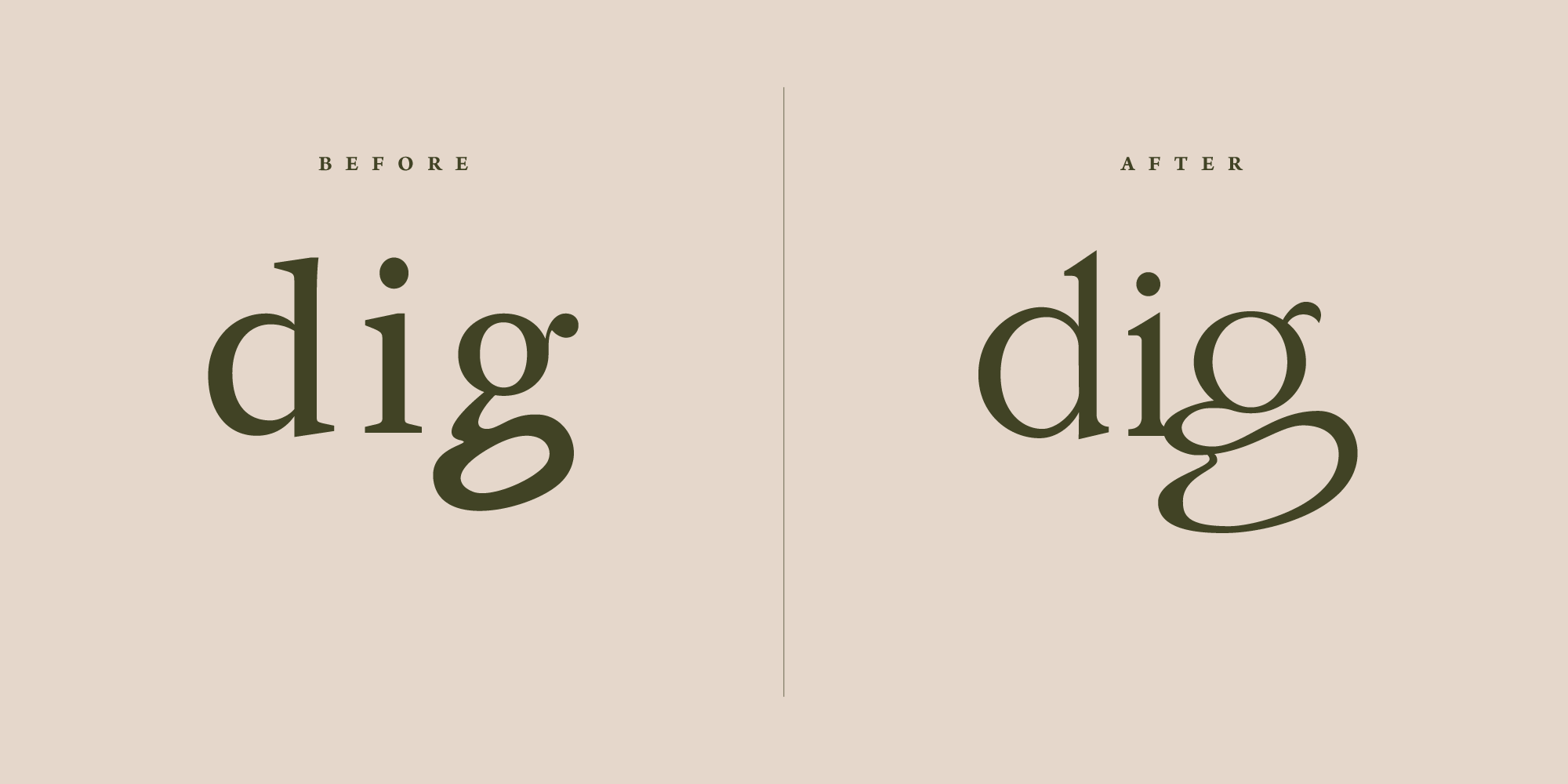
After being unsatisfied with their old logo, I was asked to redraw the letters with a natural and organic feel. The descender on the lowercase “g“ was requested to morph into an organic shape as though it was underground.
This is a great example of when custom designed logotypes are better tailored to a business than out of the box fonts.
Inspired by a germinating seed


Exploring shape and form via sketches

Final concept redrawn as vector with smooth bezier curves


